The Psychology of Billboard Design: How Colors, Fonts, and Images Influence Consumer Behavior
It’s estimated that the average person is exposed to anywhere from 4,000 to 10,000 advertisements each day from smartphone screens to street signs. It might seem like the billboard is an outdated tool, however when you’re stuck in traffic or glancing up during a walk, a well-placed and well-designed billboard can break through the noise and leave a lasting impression. Despite the dominance of digital advertising, billboards remain a powerful medium due to their size, visibility, and ability to reach consumers in the real world without requiring clicks or logins. At SignBird, we’ve photographed thousands of billboards across the country, seeing the good, the bad, and the ugly—making this an important topic to highlight. But their impact doesn’t rely solely on location or size. What truly makes a billboard effective is how it’s designed and specifically, how it speaks to the brain. A well-designed billboard leverages psychological principles through the strategic use of color, typography, and imagery to not only grab attention, but also influence consumer behavior and reinforce brand perception in seconds.
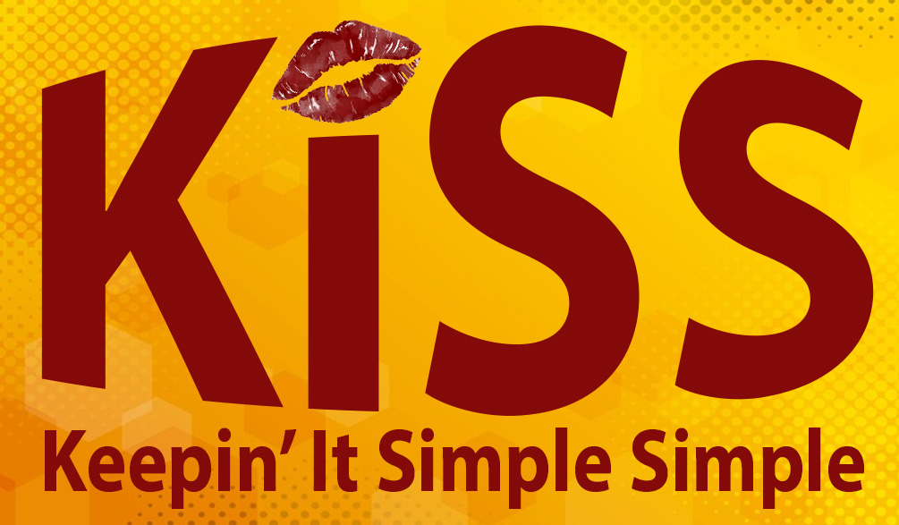
Colors are not just visual elements, they are powerful psychological triggers that evoke specific emotional responses. For instance, red often signals urgency, excitement, or passion, which is why it’s frequently used in clearance sales and fast food advertising. Blue, on the other hand, conveys a sense of trust, calm, and professionalism, making it a favorite among financial institutions and tech companies like PayPal and Facebook. Warm colors tend to be more stimulating, while cool colors are generally calming or reassuring. Colors don’t just convey emotion, they also help cement brand identity. A consistent color scheme across advertising materials increases brand recognition by up to 80%, according to marketing research. Think about Coca-Cola’s iconic red, which evokes energy and boldness, or McDonald’s bright yellow and red, designed to trigger hunger and attract attention quickly. These choices are rarely accidental. Brands that stick to a signature color palette become more memorable and trustworthy to consumers, especially when those colors align with the emotional tone of the product or service. In the fast-paced environment where billboards operate, such as highways or busy urban areas, attention must be captured in seconds. This makes high-contrast color combinations essential. For example, white text on a black background or yellow text on dark blue can significantly increase readability at a distance. Bright, contrasting hues not only help the billboard stand out visually, but also enhance cognitive processing. Studies have shown that people can recall colorful ads better than monochromatic ones, even days later.
Billboard advertising is built on speed, the message must land in three to five seconds or it’s lost. That’s why typography is more than a visual choice; it’s a psychological tool that shapes how quickly, easily, and emotionally a message is received. First and foremost, billboard typography must be instantly legible. Drivers and pedestrians don’t have the time to decipher complex fonts or small lettering. This makes font size, spacing, and weight crucial design elements. A widely accepted guideline is one inch of letter height for every ten feet of viewing distance. Paired with generous letter spacing and strong contrast, this ensures readability even at high speeds or in bright conditions. Sans-serif fonts are typically preferred in billboard design due to their clean, modern appearance and superior legibility. Typography also speaks emotionally, whether we realize it or not. A luxury brand might opt for a sleek serif font to suggest tradition and elegance, while a tech startup may choose a minimalist sans-serif to convey innovation and clarity. Typography helps establish brand personality. In a medium where seconds matter, simplicity wins. A cluttered billboard with too many fonts or overly complex lettering increases cognitive load which forces the brain to work harder to understand what it’s seeing. Effective billboard typography reduces mental friction. It uses no more than two fonts, avoids unnecessary italics or embellishments, and ensures a clear hierarchy between headlines, subtext, and calls to action.
Compelling imagery on billboards can communicate emotion and narrative almost instantly, often more effectively than words alone. A single image has the power to evoke feelings, create context, and set a tone in just a glance. The key is to select visuals that align with the brand’s message and emotional intent, helping consumers connect intuitively with what’s being advertised. Faces naturally capture human attention. Psychological research shows that we’re drawn to images of people, especially faces making eye contact. Moreover, the direction of a person’s gaze can subconsciously guide the viewer’s own focus. A model looking toward a product or logo can subtly direct attention exactly where the advertiser wants it, enhancing message retention and product recall. The most effective billboards achieve a strong synergy between image and text. The visual should reinforce and amplify the core message without overwhelming it. Clean design, thoughtful placement, and visual hierarchy ensure that the message is both clear and memorable.
In an age oversaturated with digital noise, the billboard stands out as a uniquely powerful form of advertising, one that doesn’t require a screen tap or a scroll. Its effectiveness lies not just in being seen, but in being remembered. Through the strategic use of color, typography, and imagery, a billboard can trigger emotion, capture attention in seconds, and imprint a brand message deep into a viewer’s memory. In the end, great billboard design isn’t just about what looks good, it’s about what works on a psychological level to influence perception, prompt action, and leave a lasting impression long after the car has moved on or the pedestrian has turned the corner. At SignBird, we’ve witnessed firsthand how the best billboard designs rise above the rest, while poor ones fade into the clutter. Our experience photographing billboards nationwide reinforces one truth: when designed with intention, billboards don’t just fill space, they create impact.